
Best React Component Libraries 2022 (CroCoder's Pick)
As a newcomer in the IT sphere, I spend a lot of time researching different topics relating to development. Needless to say, understanding all of the finer workings of this field helps me in doing all of my marketing-related work obligations, i.e., content creation.
While exploring the process of building web applications, I realized that there is a seemingly endless sea of open-source React component libraries to pick and choose from. Some of them are built for very specific use cases, others are intended strictly for web development and many of them are adapted for general use.
I turned to my team for guidance and considering factors that are relevant to development such as use cases, documentation, and support, we managed to create a guide of sorts that can assist developers in pinpointing UIs that suit their various needs.
These are the nine component libraries recommended by our CroCoder consultants. Let's explore which component libraries they suggest using, which are best for specific use case scenarios, and their general thoughts about them.
Contents
- Material UI
- Ant Design
- React-Bootstrap
- Chakra UI
- Next UI
- Headless UI
- Ariakit/Reakit
- Radix UI
- Reach UI
- Overview - TL;DR

Material UI
"The React component library you always wanted."
When I first started reading about component libraries, Material UI came up first. The reason behind it is that a large number of mobile and web apps actually use Material Design. Developed in 2014, Google’s MUI is a customizable component library used for building general-purpose React applications while providing a wide range of options for faster and easier web development.
It offers a comprehensive suite of UI tools that help you ship new features faster by using its fully loaded component library, or by bringing your own design systems to its production-ready components. To get a wider perspective on MUI, I consulted Marija, our Senior Web Developer, and Stefan, our Junior Software developer respectively.

Because Material UI is developed mobile-first, all of its components are responsive and adaptable to the required screen size.
Senior Web Developer

Material UI is the largest collection of ready to use components as well as a massive global community that can provide additional support if needed.
Junior Software Developer
Not only is MUI built mobile-first, but for every component that was made for web users and is not suitable for mobile users with regards to UX, there is an alternative component that was developed solely for mobile UX, for example, Mobile stepper. However, its components are built with tons of animations and there is no simple way to turn them off for mobile users. This means that optimizing your apps for mobile users requires direct interventions in the code.

The library is well documented, covering everything from installation to utility implementation guides. They also offer several free as well as multiple paid single application usage themes that sport a generous set of features. As for support, along with paid options, they offer plenty of free ones like the Material-UI community active on Stack Overflow, Spectrum, and GitHub.
The complexity of some of Material UI's animations makes them very resource-heavy for mobile devices. It can negatively influence performance, resulting in higher data usage and faster battery depletion.
Senior Web Developer
If your design system isn’t based on Material Design, it can be somewhat complicated to include MUI components in your project.
Junior Software Developer
It's worth mentioning that they are also behind the development of Joy UI, a React component library with a focus on aesthetically pleasing design. Long story short, despite the aforementioned downsides, Material UI is the most used component library on the market, and we recommend it to beginners that are after a slick design.

Ant Design
"Create an efficient and enjoyable work experience."
Ant Design or AntD was created by Ant Financial and launched in 2016 as a FinTech-orientated design system. They offer a set of more than 60 components for building enterprise-level applications, supporting charts, and boasting extensions for charts that use the same design system. This can significantly shorten the development process of web applications related to the field of finance and analytics.
While reading about AntD, I noticed that users were commenting about how opinionated Ant Design is and that it doesn't allow for much UI customization. Although not as in-depth, its documentation is easily understandable, providing examples along with API properties for each component in multiple languages. I asked Ivan and David about Ant Design because they had experience using the library on previous projects.

Ant Design provides a large number of components to choose from. If utilized as is, it makes for a very smooth experience.
Full Stack Developer

With the release of Ant Design V4, among other things, they managed to achieve great form handling.
Senior Backend & DevOps Engineer
If your project requires filling out lots of forms, AntD has your back with loads of basic and some advanced components, for example, Upload, TreeSelect, and TimePicker, just to name a few. Furthermore, all of those components can be incorporated into the AntD Form component which has an excellent API.
Ant Design might not offer loads of ready-made theme options. However, they do offer an out-of-the-box UI solution for enterprise applications called Ant Design Pro. It comes with templates, components, and corresponding design kits. They don’t offer any paid support options, but there is a very engaged community active on GitHub, Stack Overflow as well as Segmentfault. Likewise, there are loads of resources for self-learning out there.
AntD has a limited theme-altering toolset, it’s almost impossible to alter anything outside using LESS or webpack configuration.
Full Stack Developer
Not all of Ant Design's Typescript types are exposed and they don't follow a strict SemVer versioning scheme. Likewise, they use LESS rather than SASS a CSS Pre-processor.
Senior Backend & DevOps Engineer
It is quite disappointing that they are still using LESS instead of SASS because SASS proved to be superior and simpler to use, hence it ended up being more widely used. Also, NPM packages that do not use SemVer can cause issues during package version updates in a project, because NPM, PNPM, and YARN don't rely on semantic versioning. That can result in an introduction of a breaking change within a non-major release.

In conclusion, I would recommend using AntD, its AntD charts, and AntD motion to anyone that has a complicated FinTech or analytics project but has no time to edit the details in their design system. You can get loads of complex, out-of-the-box components with a good UX, but the downside is that the component design isn't as customizable.

React-Bootstrap
"The most popular front-end framework Rebuilt for React."
Reading about React-Bootstrap had me confused because, unlike other component libraries I researched for this blog post, this one has an unconventional origin story. Basically, Bootstrap was built by Twitter in 2011, predating React for almost two years. It was initially named Twitter Blueprint and it was conceptualized as an open-source CSS framework for building mobile-first, front-end websites, and applications.
React-Bootstrap was born after a team of developers on GitHub rebuilt each Bootstrap component from the ground up in React. Likewise, React-Bootstrap removed the Bootstrap JavaScript and CSS, only using the Bootstrap design system. That's why there is little to no difference between their respective components when it comes to design and markup.
Furthermore, React-Bootstrap follows all of Bootstrap's design system changes and for every new major version of Bootstrap, a new major version of React-Bootstrap is made. A decent number of people online believe Bootstrap and React-Bootstrap are maintained by the same team; this is not the case. If by any chance you encounter an issue with React-Bootstrap, you have to make sure if that problem arose within your Bootstrap theme or the React component. Depending on where the aforementioned issue originates, you'll have to create a ticket on one of the two separate repositories, hence the confusion.
React-Bootstrap's syntax is clear and readable, encapsulating Bootstrap specs into reusable components.
Junior Software Developer

Not only does React-Bootstrap provide examples of code implementation, but it also allows access to CodeSandbox examples for you to experiment with before using them in your project.
Software Developer
Even though it is a quite popular UI, I noticed that designers have a love-hate relationship with Bootstrap. That's because it's easy to modify the Bootstrap design, but no matter how much you customize it, you can never remove all of the Bootstrap elements that will give it away. Although having less than 30 components and skewing towards web development, it can easily accommodate the needs of those familiar with its framework.
Its themes are built as frameworks from the ground up as an extension of Bootstrap and all of them are reviewed against a strict set of guidelines. Because of its widespread use in web development, there are tons of both free and paid theme options to choose from. All Bootstrap themes can be used with React-Bootstrap, meaning that you can quickly achieve new designs without much effort. They don't offer any official support, however, there are loads of resources available online, along with a massive community active on Stack Overflow, Reactiflux Discord, and GitHub.
Since React-Bootstrap implements a vanilla Bootstrap visual style, most projects end up looking the same.
Junior Software Developer
Even though React-Bootstrap provides custom styles, overriding the default styles might prove time-consuming.
Software Developer
The only supported way to change the design is through Bootstrap themes and if you want to expand on the given themes, you have to know how to handle Bootstrap themes. No matter how much you change up a Bootstrap theme, all of the components still end up having that "Bootstrapy" feeling from 2012. It's super hard to explain it but if you ever used an app built with Bootstrap, you'll know what I mean. React-Bootstrap, not unlike Bootstrap, is very vanilla, simple to use, easy on the eyes, but also very recognizable and somewhat boring when it comes to design.

Chakra UI
"Create accessible React apps with speed."
Chakra UI was built by Segun Adebayo in 2019 with a design system that simplifies the process of creating more accessible web applications. Strictly following WAI-ARIA standards, they offer around 60 simple, modular and accessible components with a fresh look and feel on top of that. When it comes to component support, I was able to find an installation guide, 11 of their Styled System features, 9 styling recipe samples as well as 13 utility and 4 React hooks as of writing.
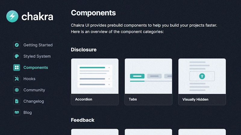
Chakra UI's goal is to design simple, composable components that cater to real-life UI design problems and their Design Principles keep their components fairly consistent.
Chakra UI offers plenty of visually impressive components with robust documentation. There is a very good changelog where you can clearly see the chronological order of any change that occurred in different versions.
Full Stack Developer
Chakra UI offers exceptionally functional components without strict ties to any design principle, thereby giving you more space when it comes to customization.
Junior Software Developer
Chakra UI bases its theming on the Styled System Theme Specification while having a Default Theme at the core of Chakra UI which allows for customized themes to be layered on top of it. There is also a component styling framework that uses modifier styles that alter components based on specified properties or state. Most of their components are built with Dark mode in mind and there is also a useColorMode hook provided for easier color mode change.
Chakra UI’s documentation is extensive, and they offer a wide range of community resources with video materials and blog posts. They also showcase different projects built with Chakra UI, while fostering a strong community on GitHub and Discord for added support.
Some of Chakra UI's props are abbreviated in a confusing way which negatively affects the readability of the code.
Full Stack Developer
Some theme customization options are not sufficiently explained in the provided Chakra UI documentation. This required some source code digging in order to figure everything out.
Junior Software Developer
Just like Ivan here, I am not thrilled about their abbreviations. Some of them make sense like 'w' for width, 'h' for height, and 'bg' for background, but things like 'pb' in the AccordionPanel, or 'mt' and 'ml' in the SliderMark component require a deep dive into their documentation in order to find out what they stand for.
Component customization is as simple as in other frameworks, however, for solving edge cases, their documentation does not suffice. That being said, Chakra UI is one of the easiest-to-use libraries out there, and as someone who doesn't have much experience in development, I was surprised with how easily I was able to navigate through this component library.

Next UI
"Make beautiful websites regardless of your design experience."
Even though it has been in Beta since 2021, I was already able to notice that Next UI is an extremely promising new component library. Sponsored by Vercel, it was created by Junior Garcia with a focus on accessibility, providing keyboard support, and following WAI_ARIA guidelines. Their components support cross-browser server-side rendering and are not strictly tied to any visual trends or design systems. Every new release brings new components, updates to old components, and an overwhelming amount of bug fixes.
Next UI provides most of your run-of-the-mill components. They have a modern design and there is support for themes as well. The best part is that it supports SSR and Typescript!
Senior Web Developer
Next UI is completely compatible with Next.js and its ecosystem and it was created to support SSR.
Senior Backend & DevOps Engineer
The team informed me that a lot of issues with Server-side rendering tend to appear while using external component libraries in a framework like Next.js. Even the popular component libraries have this same issue, and this is exactly why Vercel is behind this project. Next UI was designed to work well with SSR, which will have a major impact on development in Next.js.
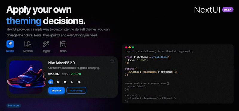
Their themes are easily customizable and with just a few lines of code, one can quickly apply dark mode. There’s a built-in Stitches package that uses their API which has to be used for theme creation and component customization. It aims to improve performance by avoiding unnecessary style props at runtime. Stitches is an awesome project with great CSS-in-JS implementation and superb developer experience. However, the Stitches API tends to bleed in Next UI and if you want to be able to use all of their theming features, you have to familiarize yourself with how Stitches works. As for support, the library has an active community on Discord and GitHub.
As of writing, some of the more basic components are still under construction.
Senior Web Developer
Next UI is still heavily under development.
Senior Backend & DevOps Engineer
My first impression was Next UI looks really great, even though it's still heavily under development. Their documentation is great and component customization is really simple. Because it's still in beta, our CroCoder consultants wouldn't recommend using it in production as of yet. A lot of basic components are still missing, and the project still has a lot of bugs, but if Next UI continues on this path, it will be a serious contender for the top spot in the component library sphere. Definitely be on the lookout for their first non-beta deployment!

Headless UI
"Completely unstyled, fully accessible UI components, designed to integrate beautifully with Tailwind CSS."
Built by Tailwind Labs in 2020, Headless UI offers completely unstyled components. This means that the user is fully responsible for the CSS implementation and if you're ever in need of one of their components, it will be easy for you to include it in your project. Tailwind Labs is also behind Tailwind CSS, and it is used to program all of the examples that Headless UI provides.
Each component comes with basic examples as well as directions on how to customize and style each component part, along with an extensive API for transitions and accessibility notes. Regarding support, there is a thriving community on GitHub and Discord where you can find general assistance and connect with other users.
Because Headless UI is an unstyled component library, it gives the user more freedom to customize the components to match their design needs.
Software Developer
Headless UI is great for users whose projects are just about finished and are in need of more complex components.
Full Stack Developer
Unlike the aforementioned component libraries, Headless UI doesn't have a large number of components, but they do offer the ones that usually require more time to implement and the ones that it is quite hard to make fully accessible like, for example, Combobox, Dialog, and Listbox.

Headless UI like other unstyled component libraries came as an answer to less customizable libraries like MUI or AntD, giving the user the ability to adapt an external component library to their own design system. Headless UI can be thought of as a collection of components that can be used to solve the complex parts of the UI/UX. If your project is in need of, for example, a Combobox, it can be easily added using Headless UI. Furthermore, it's also easy to stylize as well as push to production.
Although Headless UI's documentation contains basic examples of how to use the Headless UI components, it is not as interactive. Something like CodeSandbox would be great.
Software Developer
Headless UI seems to be incomplete, without having that many components on offer as well as missing some key ones.
Full Stack Developer
Headless UI is a project that, at the time of writing, is only two years old and the high number of components and robust documentation of some other existing component libraries have spoiled developers. Since Headless UI is still under development, there are almost monthly minor version releases, and some are bringing groundbreaking changes. This means that it can be somewhat scary using Headless UI in production and accidentally breaking it in the process.
Headless UI is backed up by a corporation that created the beloved Tailwind CSS which looks really promising. If you're building an internal component library from scratch, I would suggest you check out Headless UI's Combobox and Listbox, it can save you from implementation nightmares.

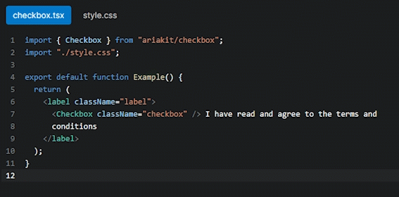
Ariakit/Reakit
"Build accessible rich web apps with React."
Another component library with a confusing origin story, let me give you the rundown. Reakit was created by Diego Haz in 2017 under the MIT License before rebranding to Ariakit in 2019. It is a low-level component library for building accessible high-level UI libraries, design systems, and applications with React. Built with a focus on accessibility, they strictly follow WAI-ARIA 1.1 standards. All components come with proper attributes and keyboard interactions out-of-the-box.

Ariakit offers uncontrolled components and helper hooks which hide their underlying complex logic, combining them you get a functioning component.
Senior Web Developer
Ariakit was built as an unstyled component library which allows for wider customization options.
Software Developer
Ariakit's toolkit is built with composition in mind and one can easily leverage any component or hook to create something new. For example, to create a functioning Checkbox, you would need to import a Checkbox component and pass the returned value of useCheckboxState() via props.
Unstyled by default, their core library components are highly customizable with each component returning a single HTML element that can accept all HTML props, including className and style. Tiny and fast, each imported component barely adds up to 3kB to your bundle size. They have an active community on GitHub for support.
Although Ariakit's components are documented, it feels like the documentation is missing some details and/or props.
Software Developer
The available documentation online is related to Reakit (Ariakit 1.0) site, but the Reakit package that can be downloaded on npm, at the time of writing this blog post, hasn't been updated for eight months. However, the Ariakit package (Ariakit 2.0) which is also available on npm, doesn't provide any documentation. That is probably why other developers that used Ariakit (Ariakit 2.0) told me that their documentation is somewhat lackluster.

Radix UI
"Unstyled, accessible components for building high‑quality design systems and web apps in React."
A project of WorkOS released in 2020, Radix UI is an open-source UI component library for building high-quality, accessible design systems and web apps. They offer easily implementable and highly customizable unstyled components while adhering to the WAI-ARIA design patterns.
I've noticed that Radix UI is not your average component library, nor is it fully unstyled like Headless UI. Their Radix Primitives are designed to be adjustable to suit the user’s needs. It is a group of low-level UI components with a focus on accessibility and customization. Therefore, Radix UI can be used as a base layer of a custom component library.
Radix UI is a simple and open-source component library that focuses more on component functionality than style. Along with providing useful components, there is the option of stylizing them according to our wishes.
Senior Web Developer
Radix UI focuses on component functionality and accessibility which is great for building something outside of a specific design pattern. Experienced developers can use it to create WAI-ARIA-compliant widgets relatively fast. A mature, open-source codebase that is constantly maintained.
Senior Web Developer
Radix UI handles all of the difficult implementation details in relation to accessibility like ARIA role attributes as well as focus management and keyboard navigation. The nature of their open component architecture provides granular access to each component part, allowing users to wrap them, and add their own event listeners, props, or refs.
When it comes to styling, the user is given complete control, with all of the components being CSS compatible. Most of the components can be implemented either as controlled or uncontrolled which allows for a smooth starting experience. Their documentation is decent, and they have an active community on GitHub as well as Discord for support.
Unlike some other open-source design systems, Radix UI is missing some components and some of them are still being implemented.
Senior Web Developer
Every component is exported in a single package with its own versioning forcing you to install them one at a time. Radix UI has multiple parts extracted as separate components, which can be confusing to unexperienced developers.
Senior Web Developer
All of the logic behind their Primitives is written within a single file, which is why, for example, Popover has over five hundred lines of code, while having all of its functionality written in hooks that are contained within a completely different package. It is quite challenging to understand the source code and if there is ever a need to make any changes or debug the code written using Radix UI, one needs to have an expert level of knowledge about these packages.
Even though Radix UI provides a large number of components and has relatively good documentation, developers are telling me that they are having a hard time navigating the code.

Reach UI
"An accessible foundation of your React-based design system."
Reach UI is a project of React Training workshops, private training, and online courses. Released in 2019, they offer 19 components for an accessible foundation for your React-based design systems. While other component libraries build an API for styling and control of their components, Reach UI claims that styling their components feels similar to styling any native element, without any additional abstractions.
Unfortunately, I found that they don’t offer any themes, but there are some basic styles that make the components usable off the shelf. Those can be overridden and added upon by using CSS, styled components, emotion, or glamor. Animation is achieved by CSS and/or composing with other React components. Their documentation seems a bit lackluster compared to other component libraries in this review. However, they have an active community on GitHub and on Spectrum for support.
Reach UI follows ARIA patterns and claims to have accessibility tested via VoiceOver and similar technologies which is a nice feature if you’re creating an accessible basis for component libraries.
Senior Web Developer
Accessibility is one of Reach UI's main priorities and the Reach organization made it their mission to build a more accessible web.
Senior Backend & DevOps Engineer
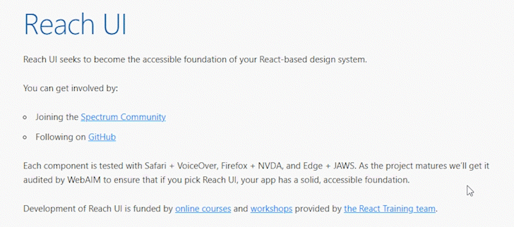
Reach UI claims that all of its components are tested with Safari + VoiceOver, Firefox + NVDA, and Edge + JAWS. This is quite a big deal when talking about accessibility because screen readers help visually impaired people quite a lot. Not only that, complex components like, for example, Datepickers or Multiselectors are very hard to use for visually impaired people, so it's really good if a Datepicker component reads out the selected date in its entirety, instead of just reading out the number.
As of writing, React v18 has brought about many changes, requiring developers to alter a large amount of code to make their components compatible.
Senior Web Developer
Reach UI's codebase is composed in a strange way, making every component a standalone package and containing all of the business logic within a single file.
Senior Backend & DevOps Engineer
React v18 has brought new hooks like react.Suspense, but also started requiring the use of Strict Mode. Unfortunately, strict mode brings more rerenders in the development circles and that can break some of the hooks used in Reach UI. As of writing this blog post, Reach UI is not compatible with React v18, but there is this issue discussion on GitHub where you can follow all of the developments.
Similar to Radix UI, all of the logic of each component is written in a single file and is treated as a standalone package. This can make it hard for unexperienced developers to understand the source code. Even though every component is a standalone package, all of the components are released simultaneously and share the same version. This goes against the rules of SemVer because the packages will be published with a new version even though some components might not have been altered after the previous version.
Overview - TL;DR
I would recommend each and any of the 9 component libraries in this review, but the following ones really stood out to me.
The best overall component library is MUI, without question. It offers an enormous number of well-made, documented, and easy-to-customize components. However, I’ve enjoyed using Chakra UI the most. Good documentation, great user experience, and a really enthusiastic community.
Furthermore, if there is a situation where I need to implement a component library from a custom-made design system, I would probably use Radix UI or Headless UI as a foundation and write my own styles afterward. Likewise, I can’t wait to see more components from the new Next UI library. I think it’s the most likely contender to give MUI and Chakra UI a run for their money.
